
Top Ten Worst Uniforms in Hockey
The worst-designed jerseys in the NHL.

This edition, we'll take a look at the worst uniforms in all of professional hockey. The bottom ten National Hockey League (NHL) jerseys are ranked from ten (decent) to one (terrible). Tune back next week for the top ten.
#10 Chicago Blackhawks
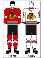
Dated (in more ways than one). Though on the better side of this worst designs list, Chicago's uniforms are showing their age. The design just isn't cutting it, and these 1962-designed jerseys are in need of a spruce-up. In addition to the old-fashioned graphics, the Blackhawks logo needs to move away from its racist and stereotypical depiction of indigenous people.
#9 Tampa Bay Lightning
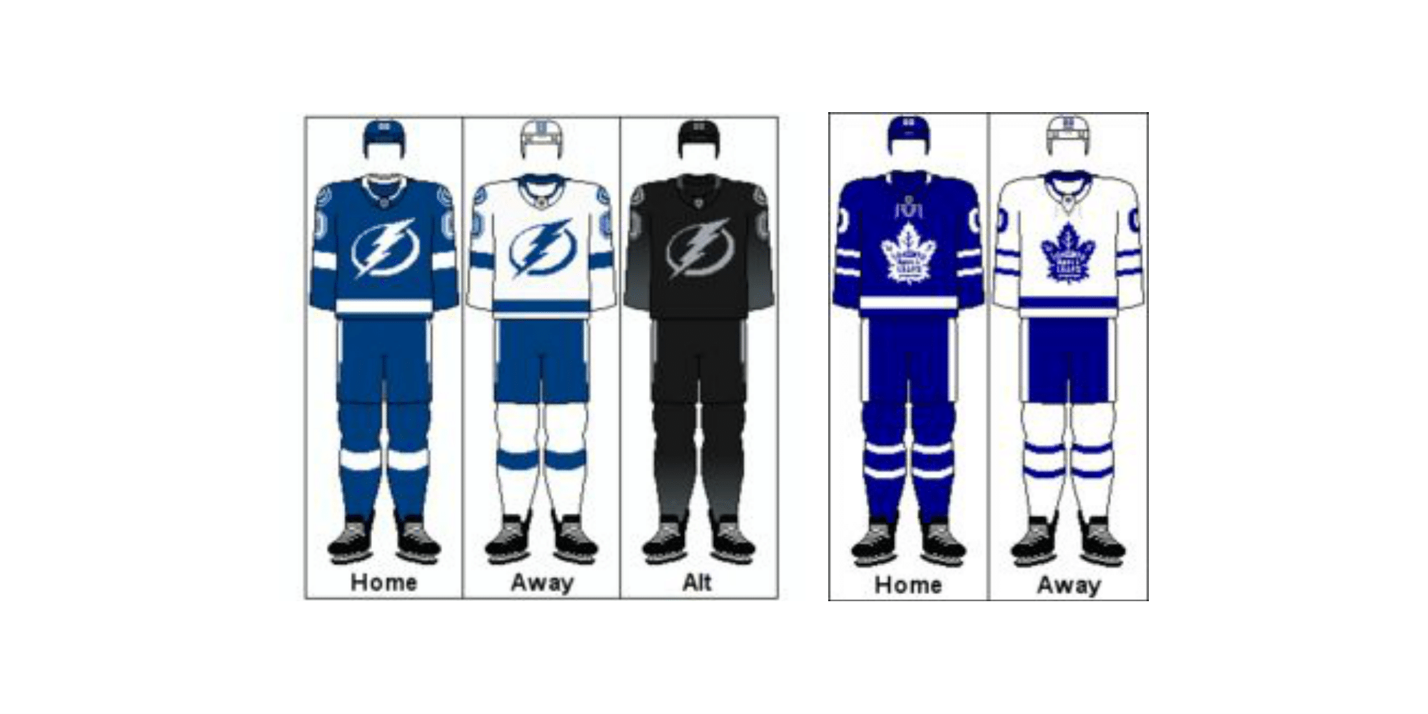
A tale of two teams. The Toronto Maple Leafs, an older team in the same division, have very similar colors and design — except the Maple Leafs do it better. Moving past the similarities between the two teams, the current uniforms simply don't stand out as much as the older ones, which capitalized on heavy black and yellow graphics for uniqueness. Switching back to the old jerseys would help the franchise stand out in the league and on the ice.
#8 Los Angeles Kings

Better options. Their uniforms are good, but they are a team that had better jerseys in the past. A switch to the gold and purple reverse retro jerseys from 2020 (that paid homage to the Los Angeles Lakers) or their alternate uniforms (which have more silver to complement the black) would give the Kings a better look. With the Fanatics uniform takeover and the trade of franchise icon Jonathan Quick, the Kings have the opportunity to make big changes.
#7 Winnipeg Jets

Easy fix. Go back to the original Jets uniforms.
#6 Dallas Stars
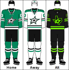
Not their best work. While they earn points on their use of the color green, they've just had much better uniforms in their history. Adding more black accents or a full return to the 90s jerseys would bring the Stars to the top 15.
#5 Carolina Hurricanes
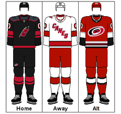
Chaotic. Since moving to Carolina in 1997, the uniforms have not been anything to write home about. While the use of maritime hurricane warning flags is a clever Easter egg for avid sports fans, the current jerseys are a bit of a mess. The home and away uniforms have very different designs, and this inconsistency holds them back.
#4 Washington Capitals
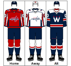
A bit on the boring side. The “Screaming Eagle” reverse retro released in 2022 is one of the best uniform designs to come out of hockey in the last 20 years, and a permanent switch to that would bring the Caps up to the top ten on the jerseys list.
#3 Columbus Blue Jackets
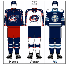
Stuck in the past. The Blue Jackets have not seen a redesign since 2007 when they debuted their aerodynamic “Reebok Edge” jerseys. Even with a shift to Adidas in 2017, the Blue Jackets' branding has stayed the same. An easy fix would be to lean more into Civil War history, showing more pride in the historical significance of Columbus.
#2 Nashville Predators

Unoriginal. Many older teams in the NHL, such as the Buffalo Sabres and St. Louis Blues, use similar blue and yellow color schemes. The lack of distinct colors and the use of a particularly jarring shade of yellow puts Nashville low on the jersey list. With Fanatics taking over as the sole distributor of NHL gear, the Preds have an opportunity to rebrand that I hope they take.
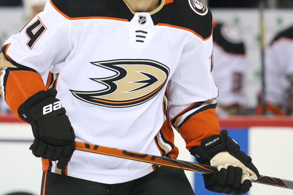
#1 Anaheim Ducks
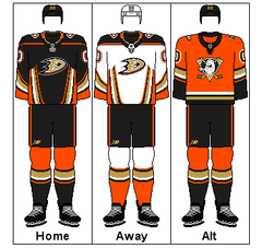
Newer doesn't always mean better. The absolute worst of NHL uniforms, the Ducks have the option for an easy solution. Ever since Disney sold the team in 2006, fans have been calling for a return to the old “Mighty Ducks of Anaheim” uniforms. The old Ducks hockey mask logo was a beloved classic, and swapping this out with the current lackluster Duck foot logo would easily bring this team to the top ten uniforms of the NHL.
Tune back in next week for the top ten logos of the NHL.